RealViz – Interactive Visualizations for Real-Life Systems

Past Talks

RealViz Talk Series Archive

Latest

  • Speaker: Adam Perer, Ph.D., Research Scientist, IBM Research & Adjunct Professor, Carnegie Mellon University
  • Title: Data-Driven Healthcare: Visual Analytics for Exploration and Prediction of Clinical Data
  • Date: January 25, 2018
Abstract: Healthcare institutions are now recording more electronic health data about patients than ever before, including data about patient conditions, lab tests, genomics, treatments, and outcomes. However, an open question remains on what one can do with all of this data. Many hope that if researchers tap into this real world observational data, the collective experience of the healthcare system can be leveraged to unearth insights to improve the quality of care. My research focuses on building interactive visual systems that support exploration so clinicians and researchers can derive such insights. During this talk, I will highlight examples of such systems, including visualizing the disease progression of patients and tools to support cohort analysis.
Adam Perer

Speaker Bio: Adam Perer is a Research Scientist at IBM's T.J. Watson Research Center, where he is a member of the Healthcare Analytics Research Group. His research in visualization and human-computer interaction focuses on the design of novel visual analytics systems. He received his Ph.D. in Computer Science from the Human-Computer Interaction Lab at the University of Maryland, advised by Ben Shneiderman. .His work has been published at premier venues in visualization, human-computer interaction, and medical informatics (IEEE InfoVis, IEEE VAST, ACM CHI, ACM CSCW, ACM IUI, AMIA). More information about Adam's research is available at http://perer.org

This RealViz Talk is sponsored by a grant from Bentley’s Data Innovation TLN.

Timelines Revisited: Considerations for Expressive Storytelling

Abstract: Timelines have been used for centuries to visually communicate stories about sequences of events, from historical and biographical data to project plans and medical records. Depending on how a timeline is drawn, different types of insights and temporal characteristics can be emphasized, such as those relating to event order, periodicity, or synchronicity. In recent years, we have seen the emergence of interactive timeline visualization tools for both data analysis and presentation. With regards to the latter, I would argue that these presentation tools lack the expressivity to communicate a range of timeline narratives, as most of them adopt the strictly linear, chronological timeline design popularized by Joseph Priestley in the late 18th century. In this talk, I will present a design space for expressive storytelling with timelines, one grounded in a survey of hundreds of timelines published over the course of history, which includes timeline designs by Gerardus Mercator and Mark Twain, as well as exemplary timelines drawn by contemporary infographic designers. Finally, I will introduce Timeline Storyteller (timelinestoryteller.com), a timeline storytelling tool that my colleagues and I have been developing, one that realizes the expressive potential of the design space.
Matthew Brehmer

Bio:Matthew Brehmer is a postdoctoral researcher with the Human-Computer Interaction group at Microsoft Research in Redmond, Washington, where he specializes in data visualization and its use in storytelling and journalism. In early 2016 he completed a Computer Science PhD at the University of British Columbia where he was a member of Tamara Munzner’s InfoVis group. During his PhD he conducted visualization design and evaluation projects in collaboration with Microsoft Research, the Associated Press / Knight Foundation’s Overview Project, and Pulse Energy / EnerNOC. On the theoretical side, he co-developed a visualization task typology that enables communication among researchers and promotes a cross-pollination of visualization design across application domains. Prior to specializing in visualization, he completed degrees in human-computer interaction and cognitive science and worked in user experience design.

Google's "Big Picture" Data Visualization

Abstract: Data is ubiquitous in our lives. It describes our neighborhoods, our cities, weather patterns, it helps track illnesses and contextualize social patterns. In an increasingly data-rich society, there’s a critical need for tools to help people understand and reason about complex information. Our research seeks to make data visualization accessible to everyone: from lay users to data experts. We will present work that exposes kids to complex data, explores the artistic expressiveness of data, uncovers the underworld of cyber crime and augments our knowledge of scientific fields such as machine learning. This approach to visualization as an inclusive communication medium points the way to a future where every citizen can more fully participate in a data-driven society.
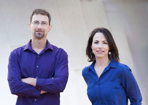
Martin Wattenberg & Fernanda Viégas

Bio:Fernanda Viégas and Martin Wattenberg lead Google’s “Big Picture” data visualization research group, which invents new ways for people to understand and explore data. They are well known for their contributions to social and collaborative visualization, and the systems they’ve created are used daily by millions of people. Viégas holds a Ph.D. from the MIT Media Lab; Wattenberg has a Ph.D. in mathematics from U.C. Berkeley. Their visualization-based artwork has been exhibited worldwide, and is part of the permanent collection of Museum of Modern Art in New York.

photo credit: Matthew Jason Warford

The Value of Visualization for Exploring and Understanding Data

  • Speaker: John Stasko, Georgia Institute of Technology
  • Time: Tue, April 12, 11:30 am – 1:00 pm

Abstract: Everyone’s talking about data these days. People, organizations, and businesses are seeking better ways to analyze, understand, and communicate their data. While a variety of approaches can be taken to this challenge, my own research has focused on data visualization. In this talk, I’ll describe the particular advantages that visualization brings to data analysis beyond other techniques. Additionally, I’ll identify three key tenets for success in data visualization: understanding purpose, embracing interaction, and identifying value. To help support this premise, I will draw upon and illustrate a number of current research projects from my lab and I’ll recount a few anecdotes and experiences that have helped to form my views.

John Stasko

Bio:John received the B.S. degree in Mathematics at Bucknell University in Lewisburg, Pennsylvania (1983) and Sc.M. and Ph.D. degrees in Computer Science at Brown University in Providence, Rhode Island (1985 and 1989). He joined the faculty here at Georgia Tech in 1989, and he is presently a Professor in the School of Interactive Computing in the College of Computing. His primary research area is human-computer interaction, with a focus on information visualization and visual analytics. John is a senior member of the ACM and IEEE. He was named an ACM Distinguished Scientist in 2011 and an IEEE Fellow in 2014. He also received the 2012 IEEE VGTC Visualization Technical Achievement Award. In 2013 John served as General Chair of the IEEE VIS conferences in Atlanta, and he was named an Honorary Professor in the School of Computer Science at the University of St. Andrews in Scotland.

Big Data Visual Analytics: A User-Centric Approach

  • Speaker: Remco Chang, Tufts University
  • Time: Wed, March 9, 11:30 am – 12:30 pm
Abstract: Modern visualization systems often assume that the data can fit within the computer’s memory. With such an assumption, visualizations can quickly slice and dice the data and help the users examine and explore the data in a wide variety of ways. However, in the age of Big Data, the assumption that data can fit within memory no longer applies. One critical challenge in designing visual analytics systems today is therefore to allow the users to explore large and remote datasets at an interactive rate. In this talk, I will present our research in approaching this problem in a user-centric manner. In the first half of the talk, I will present preliminary work with the database group at MIT on developing a big data visualization system based on the idea of predictive prefetching and precomputation. In the second half of the talk, I will present mechanisms and approaches for performing prefetching that are based on user’s past interaction histories and their perceptual abilities.
Remco Chang

Bio:Remco Chang is an Assistant Professor in the Computer Science Department at Tufts University. He received his BS from Johns Hopkins University in 1997 in Computer Science and Economics, MSc from Brown University in 2000, and PhD in computer science from the University of North Carolina at Charlotte in 2009. Prior to his PhD, he worked for Boeing developing real-time flight tracking and visualization software, followed by a position at UNC Charlotte as a research scientist. His current research interests include visual analytics, information visualization, and human-computer interactions. His research has been funded by NSF, DHS, MIT Lincoln Lab, and Draper. He has had best paper, best poster, and honorable mention awards at InfoVis, VAST, CHI, and VDA. He is currently an associated editor of the ACM Transactions on Interactive Intelligent Systems (TiiS) and the Human Computation journals, and he has been a PC and in organizational roles in leading conferences such as InfoVis, VAST, and CHI. He received the NSF CAREER Award in 2015.

Process Mining

  • Speaker: Vatche Ishakian, IBM
  • Time: Wed, February 24, 11:30 am – 1:00 pm
Abstract: Everyone’s talking about data these days. People, organizations, and businesses are seeking better ways to analyze, understand, and communicate their data. While a variety of approaches can be taken to this challenge, my own research has focused on data visualization. In this talk, I’ll describe the particular advantages that visualization brings to data analysis beyond other techniques. Additionally, I’ll identify three key tenets for success in data visualization: understanding purpose, embracing interaction, and identifying value. To help support this premise, I will draw upon and illustrate a number of current research projects from my lab and I’ll recount a few anecdotes and experiences that have helped to form my views.

Vatche Ishakian

Bio:Vatche Ishakian is a Research Staff Member in the Service Integration and analytics Group at IBM T.J. Watson Research Center. He Received his Ph.D. degree in Computer Science from Boston University under the supervision of Professor Azer Bestavros.